 图文自动循环+点击切换"/>
jQuery图文自动循环+点击切换
jQuery实现图文自动切换和点击切换
效果演示
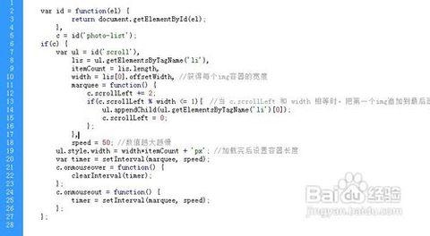
jQuery图文自动循环切换+点击切换
HTML:
<div class="imgswitchwrap"><div class="imgswitch"><div class="imgswitchlink"><a href="javascript:;" class="active"><font>01</font>千与千寻</a><a href="javascript:;"><font>02</font>侧耳倾听</a><a href="javascript:;"><font>03</font>幽灵公主</a></div><div class="imgswitchlist"><div class="itemwrap now"><div class="item"><div class="imgbox imganimation" aos="fade-right"><img src="img/img03.jpg" /></div><div class="right" aos="fade-left"><div class="text"><font># point 01</font><p>Miyazaki Hayao</p><h3>千与千寻</h3><h4>人生就是一列开往坟墓的列车,路途上会有很多站,很难有人可以自始至终陪着走完。当陪你的人要下车时,即使不舍也该心存感激,然后挥手道别。</h4><a href="javascript:;">view more<i class="fa fa-angle-right" aria-hidden="true"></i></a></div><a href="javascript:;" class="more">read more</a></div></div></div><div class="itemwrap"><div class="item"><div class="imgbox imganimation" aos="fade-right"><img src="img/img0103.jpg" /></div><div class="right" aos="fade-left"><div class="text"><font># point 02</font><p>Miyazaki Hayao</p><h3>侧耳倾听</h3><h4>决不能习惯失败,因为你要知道,身体的疲惫,不是真正的疲惫;精神上的疲惫,才是真的劳累。</h4><a href="javascript:;">view more<i class="fa fa-angle-right" aria-hidden="true"></i></a></div><a href="javascript:;" class="more">read more</a></div></div></div><div class="itemwrap"><div class="item"><div class="imgbox imganimation" aos="fade-right"><img src="img/img0104.jpg" /></div><div class="right" aos="fade-left"><div class="text"><font># point 03</font><p>Miyazaki Hayao</p><h3>幽灵公主</h3><h4>我们的生命太短,来不及见证那些遥远到令人恍惚的词语,比如天长地久,海角天涯,碧落黄泉,沧海桑田。</h4><a href="javascript:;">view more<i class="fa fa-angle-right" aria-hidden="true"></i></a></div><a href="javascript:;" class="more">read more</a></div></div></div></div></div>
</div>
CSS:
/* 图片循环切换 */
/* more */
.more{display: block;width: 180px;height: 48px;border: 1px solid #e60021;text-align: center;line-height: 48px;font-size: 14px;color: #e60021;position: relative;z-index: 0;text-transform: uppercase;font-weight: bold;}
.more:after{content: '';display: block;width: 0%;height: 100%;background-color: #e60021;position: absolute;left: 0;top: 0;z-index: -1;transition: all .3s;}
.more:hover:after{width: 100%;}
.more:hover{color: #FFFFFF;}
/* imgswitchwrap */
.imgswitchwrap{position: relative;width: 100vw;height: 100vh;background: url(../img/bg02.png) #EEEEEE;box-sizing: border-box;display: flex;display: -webkit-flex;-webkit-justify-content: center;justify-content: center;-webkit-align-items: center;}
.imgswitch{width: 80%;position: relative;position: relative;}
.imgswitchlist .itemwrap{width: 100%;position: relative;display: none;z-index: 0;}
.imgswitchlist .itemwrap:first-child{display: block;}
.imgswitchlist .item{width: 100%;display: flex;display: -webkit-flex;-webkit-justify-content: space-between;justify-content: space-between;position: relative;z-index: 1;}
/* right */
.imgswitchlist .item .right{width: 50%;box-sizing: border-box;position: relative;margin-left: -20%;display: flex;display: -webkit-flex;-webkit-align-items: flex-end;align-items: flex-end;padding-left: 140px;padding-bottom: 80px;margin-bottom: -80px;}
.imgswitchlist .item .right .text{background-color: #FFFFFF;box-sizing: border-box;padding: 100px 100px 100px 100px;position: relative;margin-bottom: -40px;}
.imgswitchlist .item .right .text font{writing-mode: tb;position: absolute;right: 60px;top: 40px;font-size: 14px;color: #666;opacity: 0.3;text-transform: uppercase;}
.imgswitchlist .item .right .text p{font-size: 16px;color: #666666;text-transform: uppercase;margin-bottom: 14px;font-weight: bold;}
.imgswitchlist .item .right .text h3{font-size: 40px;color: #000000;margin-bottom: 30px;}
.imgswitchlist .item .right .text h4{font-size: 20px;line-height: 32px;color: #666666;margin-bottom: 40px;text-align: justify;min-height: 94px;overflow: hidden;display: -webkit-box;-webkit-line-clamp: 3;-webkit-box-orient: vertical;}
.imgswitchlist .item .right .text a{display: flex;display: -webkit-flex;-webkit-align-items: center;align-items: center;font-size: 16px;color: #e60021;text-transform: uppercase;}
.imgswitchlist .item .right .text a i{font-size: inherit;color: inherit;transition: all .3s;margin-left: 20px;}
.imgswitchlist .item .right .text a:hover i{transform: translateX(20px);-webkit-transform: translateX(20px);}
/* more */
.imgswitchlist .item .right .more{position: absolute;left: -140px;bottom: 0;width: 278px;height: 78px;line-height: 78px;background-color: #e60021;color: #FFFFFF;}
.imgswitchlist .item .right .more:after{background-color: #FFFFFF;}
.imgswitchlist .item .right .more:hover{color: #e60021;}
/* imgbox */
.imgswitchlist .item .imgbox{width: 70%;overflow: hidden;position: relative;}
.imgswitchlist .item .imgbox img{display: block;width: 100%;}
.imganimation:before,.imganimation:after{position:absolute;top:0;left:-100%;z-index:15;display:block;content:'';width:50%;height:100%;background:-webkit-linear-gradient(left,rgba(255,255,255,0) 0,rgba(255,255,255,.3) 100%);background:linear-gradient(to right,rgba(255,255,255,0) 0,rgba(255,255,255,.3) 100%);-webkit-transform:skewX(-25deg);transform:skewX(-25deg);}
.imgswitchlist .itemwrap.now .imganimation:before{-webkit-animation: shine 1s ease-out .5s;animation: shine 1s ease-out .5s;}
.imganimation:hover:after{-webkit-animation: shine 1s ease-out .3s;animation: shine 1s ease-out .3s;}
@-webkit-keyframes shine{100%{left:125%}
}
@keyframes shine{100%{left:125%}
}
@-webkit-keyframes imganim{0%{transform:translateX(-100%)}
100%{transform:translateX(100%)}
}/* imgswitchlink */
.imgswitchlink{position: absolute;right: 0;top: 0;z-index: 1;}
.imgswitchlink i{display: none;}
.imgswitchlink a{display: block;padding-left: 120px;position: relative;margin-bottom: 30px;font-size: 22px;color: #000000;opacity: 0.4;}
.imgswitchlink a font{font-size: inherit;color: inherit;margin-right: 30px;}
.imgswitchlink a:last-child{margin-bottom: 0;}
.imgswitchlink a:before{content: '';display: block;width: 50px;height: 1px;background-color: #000000;position: absolute;left: 0;top: 50%;transition: all .3s;}
.imgswitchlink a:hover:before,.imgswitchlink a.active:before{width: 90px;background-color: #e60021;}
.imgswitchlink a:hover,.imgswitchlink a.active{opacity: 1;color: #e60021;}
jQuery:
<script>$(function(){var a=1,time=3000,s;function test(){if(a == 3){a=0;}$('.imgswitchlist .itemwrap').hide().filter(':eq('+a+')').fadeIn('slow');$('.imgswitchlist .itemwrap').removeClass("now").filter(':eq('+a+')').addClass("now");$(".imgswitchlink a").removeClass("active").filter(':eq('+a+')').addClass("active");a++;s=setTimeout(test,time);}s=setTimeout(test,time);$(".imgswitchlink a").click(function () {$(this).addClass("active").siblings("a").removeClass("active");$ ('.imgswitchlist .itemwrap:eq(' + $ (this).index () + ')').fadeIn("slow").siblings ().hide();$ ('.imgswitchlist .itemwrap:eq(' + $ (this).index () + ')').addClass("now").siblings ().removeClass("now");clearTimeout(s);var b=$(".imgswitchlink a"),c=b.index(this);a=c+1;s=setTimeout(test,time);});})</script>
更多推荐
jQuery图文自动循环+点击切换


发布评论